LACMA Reflection
The field trip to LACMA left me more or less unsatisfied, if I am going to be completely honest. Though the collection covers a wide breadth of works and boasts a fabulous campus, I found that much of what I wanted to see was either unavailable or required an upgrade payment. Fortunately I was able to visit the Guillermo del Toro exhibit, even if it required a little bit of lying. After becoming a “NEXGEN” member of the museum, I was granted free access to this exhibit, which was truly unique. The del Toro exhibit is intriguing because it allows patrons to see not only del Toro’s work, but his inspiration and roots. However, other than this exhibit, I felt a little let down. Nonetheless, I made the most of the time and enjoyed the visit itself, as Museum Row is quite gorgeous and the weather was flawless.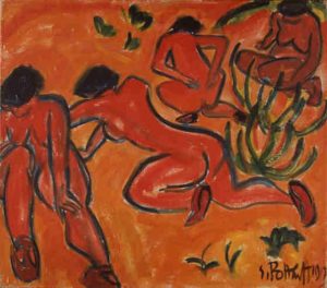
For this post, I chose to focus on the painting Bathers (1913) by German artist Karl Schmidt-Rottluff. This work, which is a moderately sized oil canvas (34 1/2 x 39 5/16 in.), can be found on the second floor of the Ahmanson Building. Though I saw many works that exuded modernism, I chose this painting because I felt as though it pertained to some of the recent class discussions on Primitivism and Exoticism. Bathers was hung in a part of the gallery that had other similar works, ranging from Cubism to Expressionism to Abstraction. Because most of these movements unfurled in similar eras, this painting fit right in. Aspects of this painting—such as the colors, the harsh outlines, and sparse background—remind me of Picasso’s Les Demoiselles d’Avignon, a work that seems to border Cubism and Primitivism. The bathers themselves, who are nude and assumably in the wild, evoke a sense of primal life, as there is no indication of modern lifestyle within the canvas. It was actually pretty special to be able to view works in this gallery that we have studied in this class, as well as works that I had viewed in my two art courses over the course of this semester.
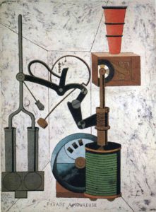 The room in which this “machine” of sorts is placed is just as confusing; the converging lines don’t quite line up, giving the space a wonky perspective that provides a visual challenge, almost like that of an optical illusion, though far more subtle. The machine, which reminds one of a Rube Goldberg contraption, defies functionality, as it’s purpose is not clearly visible. The title of the piece—Love Parade—lends no hands in the matter, either.
 I also chose to include the circular manuscript, The Magic Circle of Infinity,
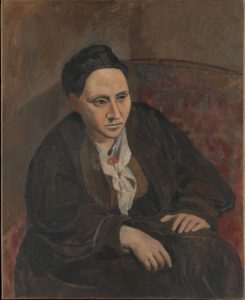 In reacting to this painting, what stood out to most was the general lack of color variety within the canvas. The painting, which features almost exclusively warm neutrals based in red pigment, depicts a seated Gertrude Stein draped in what seems to be heavy clothing—an engulfing coat of some sort with what appears to be a dress or blouse underneath—staring into the distance with her hands relaxing in her lap. The background provides close to no context, as it is merely a wash of color with some semblance of an implied pattern near the right. Due to the color scheme as well as the date provided, it is apparent that this work is from what is referred to as Picasso’s “Rose Period.” However, with this work being created at the very end of the period, it almost foreshadows the impending Cubist era that was in the near future for the artist. In comparing this painting to
 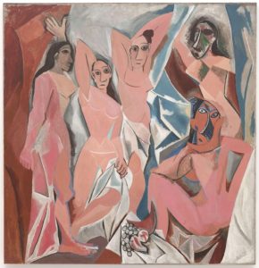 Picasso’s masterpiece of the following year, Les Demoiselles d’Avignon, there is a clear repetition of facial structure/features between Stein and the two central women of Les Demoiselles. It could even be inferred that, due to the similarities in the noses, eyes, and eyebrows, Stein, or her portrait, may have served as inspiration for one or more of the women in the 1907 Cubist work. The portrait of Stein still maintains certain aspects of Impressionist, as she is surrounded by—and partially comprised of—visible brush strokes and unblended colors. Despite this, there is a clear departure from the need to create an impression of the surroundings, as the face of Stein is rather well rendered with appropriate value.