Browsed by
Category: Special Collections

Braque and the creation of the avant-garde. Der Ölbaum (1907).

Braque and the creation of the avant-garde. Der Ölbaum (1907).

  Vs.  georges_braque_paisaje_l_estaque_ii

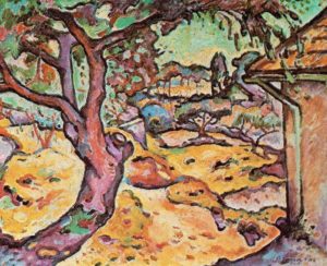
During his youth, most of George Braque’s artpieces where influenced and inspired by the works of Henri Matisse and André Derain; the founders of Fauvism. It was a movement that was mainly characterized by the use of bright, vivid, and polychromatic colors. This, along with the use of “rough”, and “instinctive” brush strokes is what coined the term “Les fauves”(Wildcat in English). I first encountered The painting “Der Ölbaum (1907)” by George Braque on what appeared to be an antique catalogue that was used by the “Salons” at the time to cultivate public interest on any ongoing expositions. Considering that color printing was so expensive at the time, the catalogue showed a black and white version of the painting.

After looking for an online picture of the painting, what appeared to be the post-impressionist work of a prominent artist, transformed into something totally different. Patters of peculiar clashing colors designed to shock the audience depicted something that totally opposed the colors of the mental picture I had for the painting. By virtue of that, and because Fauvism was largely about embracing the use of irrational color patterns, the feel and emotions of the landscape in the painting depict a much more vibrant and bright atmosphere. Furthermore, the colored version of the painting also allowed me to obtain a better visualization of the aggressive brush strokes present. A style that is often present in a lot of the former artistic movements (such as impressionism), and were often designed to shock the general public; because of this, I believe that the style of this painting reflects the cultural desire of the time to reveal against conservative art ideals.

Overall, I can say that the color and style are the main mediums through which Fauvism sets itself apart from other artistic movements. This is important because the fact that I first encountered the painting in black and white, allowed me to obtain a better appreciation for it. Sure, I was totally shocked by the color selection and aggressive style used, nevertheless, the impact this had on what once was a more conservative public is what makes these innovative movements such as Impressionism and Fauvism revolutionary. This “entrepreneurial” approach many of the modern artists took is what laid the foundations for future artistic movements at the time. In this case, this is what laid the foundations for the early XXI century movement, Cubism.

References:

Phillips, Sam. –Isms: Understanding Modern Art. New York, NY: Universe Publishing, 2012.

Gray Black…San Bernardino Mountains:

Gray Black…San Bernardino Mountains:

The etching is one of many in a book of etchings. The etching: Gray Black…San Bernardino Mountains is the 12th etching in the book. The etching reflects the artistic influence of much of the turn of the century art movements: etchings. Initially etchings were used for artists to distribute their message because of the minimal costs associated with mass-producing etchings. Eventually, etchings, such as the ones found in this book became high art praised in the art world. The artist uses wood block prints, which is only produced in black, white and grey. The contrast between the light and dark causes a dramatic etching of the tranquil wilderness. The dark trees in the middle of the etching sit on the white hill, creating a stark color contrast that pops off the page. The book was created to display this tremendous collection of etchings. These etchings are all off beautiful natural scenes through California with highlights in Big Sur and the San Bernardino mountains. Being able to visit special collections at Oxy was fantastic because I was able to truly see the beauty of these etchings. Often time’s photos do not do the actual piece of art justice. Being able to see the etchings in person allowed me to fully appreciate the contrast of colors on the page

.img_8040

La Encina Yearbook—Class of 1933

La Encina Yearbook—Class of 1933


img_0969img_8146


The editor of the yearbook not only selected the pieces of article and photos that represent college life overall, but also fitted these information into special and simple layout that informs the readers the style and unique characteristic of Occidental College. It’s not hard to see the editor’s intention to artistically designing the first letters of every piece of article to add more creative elements into the yearbook. The yearbook silently introduces the readers all the members in fraternities and sororities, sports team, hall presidents, student organizations and so on. The thickness of each page implies its delicacy and the editor’s wish that readers will respect the information presented. As I was carefully turning the pages, because of the paper’s thickness, I could feel the editor’s wish to let readers have a whole appreciation of this yearbook, not only the words and photos on the paper, but also the paper itself.


Being able to interact with the work directly, I feel more attracted to the content more willing to learn more about the background of it. And thinking that other occidental alumni throughout the history may have also read the yearbook as as I do today , I feel more connected to this school.

“In the Back Real”

“In the Back Real”

“In the back of the real” by Allen Ginsberg is a short poem of three stanzas and 24 lines, 25 including the title as a line. The book it is a part of, Howl, was written in 1955 (Wikipedia). Given the context it was written in, 1950s America (indicated by San Jose as a location in the poem), an industrial period of American history, the subject makes sense. The subject is “A flower”, and it is called the “flower of industry”, described as a “tough spikey ugly flower”. This could be a criticism of America’s increasing consumerism, or greed of businesses.

In terms of place, assuming the “railroad yard in San Jose” is referring to San Jose, CA, I can imagine the setting described. I see a hot train station, likely a combination of my experiences of train stations from various places, and my past of the heat of the South Bay Area. I can see a dead flower on the ground. However, the poem flower seems to be merely an “ugly flower”, that wants to be something better: “with the form of the great yellow Rose in your brain!”, which again, seems to show a feeling of disdain for American consumerism or business.

Sources: After finding info I was looking for on the publication date of Howl on Google, it listed the wikipedia page on Howl as the source.  https://en.wikipedia.org/wiki/Howl


Camera Work by Alfred Stieglitz

Camera Work by Alfred Stieglitz

Upon visiting the Special Collections archive, I was most drawn to Alfred Stieglitz’s photographic journal, Camera Work. Stieglitz is remembered by his critical role in promoting photography as an art form on par with painting and other conventionally accepted mediums in addition to his function in organizing and reorganizing artistic platforms in the late nineteenth and early twentieth century’s avante-garde art scene.  Camera Work was a journal Stieglitz began in 1903 in order to carve out a visual space exclusively by and for photographers during a time in which photography was both less common and valued more for its scientific function.

The particular copy in the archive’s collection however is dated from 1914, therefore eleven years older than the birth of the first issue. The journal’s minimal form, clear attention to precise details, and high publication quality for its time offer insight towards Stieglitz visual and ethical sensibility, as he was notoriously responsible for a perfectionist oversight of all aspects of Camera Work’s publication process.  The individual images of landscapes, portraits, and infrastructure are as effective in conveying momentary snapshots as the collective body is in conveying a snapshot of early photography’s place in the modern art world.  The photographs point to the immediacy valued in modern art that seeks to deviate from realism’s obsession with the past and time consuming practice of extraordinary detail.  However, Camera Work engages in this dialogue with its elaborate hand-drawn letters and crisp binding that required the same type of time consuming craftsmanship.  As such, Stieglitz’ journal seems to effectively establish its respected place among painterly work of its time while also creating a tension between these conventional standards given that Camera Work’s was birthed out of Stieglitz’s effort to create new channels for artistic curation and appreciation (much like the Salon des Refusés).

Being in the presence of this artifact solidifies Camera Work’s societal intent and Stieglitz perfectionist reputation.  Having the opportunity to physically observe and touch the photos that had to be adhered (not digitally printed) to each page of each issue garnered a new type of respect far greater than if I had simply viewed these images digitally.  Given Stieglitz involvement in the publication, I believe being in the physical presence of the journal was necessary for understanding and honoring the journal’s sheer novelty and intent.

fullsizerender-3 fullsizerender-4


The Ballad of Reading Gaol

The Ballad of Reading Gaol

img_5737img_5738

The Ballad of Reading Gaol was what had caught my eye at the Special Collections. The fact that Oscar Wilde had not used his real name in publishing his work felt fitting to his situation, and I felt that the book in its entirety was a physical reminder of his time spent in exile. The Ballad of Reading Gaol was first published in 1898 after Wilde’s release from prison in 1897. The book is small and light, with a very simple, neutral coloured cover. Notably the author is stated to be “C.3.3”, and only when the 7th edition was published was it known that “C.3.3” was in fact Oscar Wilde. The inside of the book remains rather simple without images or a specific design. Despite the bland exterior of the book, the content and its context paints an in-depth picture of the meager and depressing penal system through the poetic illustration of the execution of a fellow inmate. The exterior of the book accompanies the dark themes within the book and the structure of the content (one single, long poem) also created the impression of what prison would seem like; long and inexorable. While Oscar Wilde’s poetry is in itself known as a significant work of art, I felt that seeing this book in its fragile and unnoticeable state ironically gave it poetic life.

The Autobiography of Alice B. Toklas – Gertrude Stein

The Autobiography of Alice B. Toklas – Gertrude Stein

       The object from Special Collections that I have chosen to analyze is the copy of Gertrude Stein’s most famous book, The Autobiography of Alice B. Toklas. Much of what interested me about the artifact lies with its design and presentation. I was intrigued to see that the design of the cover was Stein’s famous poetic line, “Rose is a rose is a rose is a rose,” embossed onto the front in a circle to emphasize its circular reasoning. However, that line is not from this book, but one of Stein’s previous poetic collections. I would theorize that the designers chose that famous line in order to inspire name recognition among readers. The photographs interspersed with the text were another facet of the design that i found enjoyable. They certainly reflected the time period of the book; they were all obviously in black and white, and the dress worn by the people depicted made clear the era as well. Additionally, there were photos emphasizing Stein’s connection to Pablo Picasso. One photo shows a wall in her apartment that was hung with various works of his, and another shows Picasso himself standing with another of Gertrude and Alice’s friends. Another aspect of the times shown in the photos is the lack of noticeable affection between Gertrude and Alice in the photos; had the book been released today, the photos selected might make clearer the romantic status of their relationship. All of these things give strong support to details of Gertrude and Alice’s lives as represented in the text, and complement the text in a way that enriches the experience of reading it as opposed to viewing it as a more condensed and impersonal PDF.

Dubliners, 1914

Dubliners, 1914

  img_9308
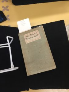
The object I found most interesting in Special Collections was the first edition of Dubliners by James Joyce, published in 1914. This attraction is mostly due to my natural affinity for first-edition anything – when I buy records I prefer first-editions, not necessarily to play, but rather to transport me back into that time period as something my parents or the artist would own, advancing my appreciation for the music. A major component of my senior-year English class was based around Dubliners, in which several stories intrigued me due to Joyce’s writing style. Reading from a book with a cover elaborately decorated and with a few illustrations scattered here and there, it was quite interesting to see such a simple first edition, with a plain red cover and a simple “Dubliners” written at the top in gold lettering. With such a simple edition, I could see the images Joyce was attempting to provoke in his stories being solely up to the reader’s imagination, rather than supplementing it with illustration as in later editions. As with the example of the records, holding this first-edition gave off a very heavy feeling and brought me back to 1914, establishing a stronger connection to Joyce’s masterpiece.

e.e cummings’ book of poetry

e.e cummings’ book of poetry

The object that I found to be the most interesting (not an easy pick by any means!) was the small blue book of e.e cummings’ poetry. I choose this object because of my love of his poetry, which made being able to personally hold a very early copy of his work particularly meaningful. The book itself was beautiful, the cover was very simplistic, however it was a really rich shade of blue. Cummings’ poetry is poetry that is very much meant to be seen visually, as a lot of the meaning of the poetry is found in the way he chooses to display the poems on the page. I have many books of his works, so although it was not my first time seeing the poetry in person, it did make it particularly meaningful to be able to psychically interact with something that I consider extremely important to me. Not to overstate it, but it really remind me of the concept of transcendence, in the way that I was able to derive such personal meaning from an object that was originally created decades ago. By physically interacting with the object I had a real sense of connection with all of those who were impacted by his poetry, even though we might be separated by decades. I found this to be really comforting, and really liked our visit to the special collections.

George Crumb Manuscripts

George Crumb Manuscripts

img_1592 
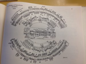
Out of everything in Special Collections, there was nothing else that I was drawn to as much as these manuscripts by George Crumb. It is easy to tell from the manuscripts that his work was avant-garde, but you can also tell by listening to the pieces being played. The pieces that I looked at were Crumb’s Prophecies of Nostradamus and Agnus Dei.

What is quite intriguing about Prophecies of Nostradamus is unless you are some sort of musical genius, if you were to listen to the piece without looking at the sheet music, you would have absolutely no clue what the time signature is (13/4 then 11/4 in fact), and completely lose track of the idea of what constitutes one beat. I feel that this was one of Crumb’s main objectives–to confuse others and get them thinking about what music is supposed to sound like. I can see why he would call this the title that it is, as Nostradamus is most famous for prophecies about disaster, and this piece definitely sounds like the world is about to end, with his use of constant secondary dominants and forte dynamics.

img_1595Now every Agnus Dei that I have heard is different, but this is one extremely different format wise. The format is rightfully in the shape of a peace sign, as there is a part in piece saying “Dona nobis pacem,” which means “Give us peace” in latin. You also have to actively look for where this piece starts (it starts at the left diagonal line of the peace sign). This makes it difficult for the musician playing not only because of the format, but also because it requires vocalization from them. I would not go and say that this is the most creative version I have seen (go look at Agnus Dei by Leonard Bernstein), but it certainly is something else.

With both of these pieces, seeing them in person as opposed to online gives the person looking at it a greater sense of interaction. Not in the sense of just being able to touch it, but being able to read them easier, see all the small notes that you may not have seen on the screen, and you do not need to tilt your head in impossible angles.