Browsed by
Author: jane

LACMA: “Construction for Noble Ladies” (Kurt Schwitters, 1919)

LACMA: “Construction for Noble Ladies” (Kurt Schwitters, 1919)

img_2378

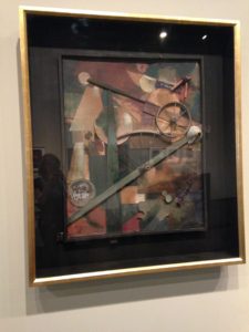
One of the more intriguing movements in the history of modernist art is that of Dadaism. Dadaist paintings were rarely just that: they frequently used different mediums, such as pieces of printed material, sand, and found objects, in their works along with paint. This creates an intricate texture, one that cannot be fully conveyed by p hotographs. Kurt Schwitters’ Construction for Noble Ladies, currently on display at the Los Angeles County Museum of Art, is a perfect example of a dadaist found-object “painting”. This work mimics a traditional painting, and, in fact, is displayed in a room full of them. However, Schwitters’ piece is comprised of several seemingly random objects, including a wheel with broken spokes, a ticket for shipping a bicycle, a funnel, a flattened toy train, and other bits and pieces of detritus, along with paint.

The three-dimensional texture of this masterpiece is not properly conveyed through photographs. In a photograph, the effects of the layered depths of the different parts of the work is somewhat diminished, and the work develops an overall sense of unity that takes away from the experimental nature of the piece. Seeing this work in person highlights the distinct contrast within the work created by Schwitters’ use of almost sculpture-like relief. The intricacies in texture are much clearer, and give a better overall understanding of the piece.

The juxtaposition of this work and the other pieces in the gallery also adds to the avant-garde nature of the piece. Even though the paintings currently displayed on either side of this work are modernist and were experimental art for their time, Schwitters’ creation is clearly cutting edge on another level entirely. It also adds to the absurdity of the dadaist movement as a whole: you don’t typically walk into a German Expressionism gallery in a major art museum expecting to see a flattened toy and an old receipt painted to a piece of cardboard and hung on the wall. This helps the viewer better understand the context in which the dadaist movement existed, and thus better understand how Schwitters’ piece and other dadaist works were received.

Arnold Schoenberg: Pierrot Lunaire

Arnold Schoenberg: Pierrot Lunaire

Schoenberg might not seem an Expressionist when initially compared with the other artists of the movement, yet upon further examination, his work, especially Pierrot Lunaire: 18. Mondfleck fit the descriptions of Expressionist work.

Although most of his words follow a rhythm that suggests a regular speech pattern, Schoenberg uses pitch to emphasize the syllables and words that aren’t stressed when the word is spoken, such as “und” or the second syllables of “plotzlich”, “Mondes”, “richtig”, etc. While this might be expected in lyrics that had been translated from the language in which they were put to music, since Schoenberg used the German translations of the poems when he wrote the pieces, this adds to the text painting of the music in the piece. It creates the sense of something slightly chaotic or not quite making sense, like the man who can’t figure out that the spot on his jacket is merely light. In this way, his piece reveals the inner mental state, and not the exact events of the scene depicted, one of the main characteristics of Expressionism.

Another main idea of Expressionism was the lack of emphasis on whether or not the work was aesthetically pleasing by traditional standards. Schoenberg’s music certainly fits this criteria, as well: he rejected the traditional tonality of music that is still widely accepted today, and created a work that completely countered the standards. This was part of the appeal to Schoenberg and his followers: they had the ability to create music that didn’t fit what anyone else’s idea of music was; rather, they had much more freedom in how to express their thoughts.

Preludes, T. S. Eliot

Preludes, T. S. Eliot

Collected Poems 1909-1925, pp. 12-13


This poem, divided into four sections, depicts the change of a street throughout a day. Section I describes the deserted street in the evening, followed by Section II describing the same street in the morning. Section III contrasts with the first two, as it is written in second and not third person, and describes a person presumably living on the street and not the street itself. Section IV begins by describing the street’s return to the evening state, seemingly ending at the time the first section starts. The poem ends with a reflection on an infinite recurring change, culminating with the final lines


“The worlds revolve like ancient women

Gathering fuel in vacant lots”


I love the continuity between the images in the different sections of the poem. For example, the “burnt-out ends of smoky days” in the first section become the “short square fingers stuffing pipes” in the last. Section I centers around the idea of rain pounding the street in the evening, and those showers become the “muddy feet that press/To early coffee stands” in Section II, and in turn the city block “trampled by insistent feet” in Section IV. The recurring, yet changing images are what create the idea of a continuous cycle.


The most literal interpretation of the cycle of the poem is as the cycle of night and day, yet the use of winter imagery at night gives additional layers to the poem, as does the first line of section IV:


“His soul stretched tight across the skies

that fade behind a city block”.


Eliot is likely referring to phenomena such as the change of seasons and the process of aging in human life. Of course, in true Eliot fashion, this cycle is portrayed as something dull, unchanging, and dirty–his descriptions throughout the poem use words like “grimy,” “withered,” “dingy,” “sordid,” etc.
This poem is an accessible poem. Although I’m probably missing some allusions and more complex metaphors, I was still able to appreciate it and gain additional meaning from it, as would have most readers at the time the poem was originally published.

Kurt Schwitters: “Ursonate” (1922-32)

Kurt Schwitters: “Ursonate” (1922-32)

According to Tristan Tzar, “Dada” doesn’t mean anything–that is, there are several things it could mean but none of them are the one true intended meaning. It is, then, left up to the reader of his 1918 Dada Manifesto to extrapolate their own meaning from the word. It is in this vein that Kurt Schwitters’ 1922-32 work Ursonate was written: part poem, part sonata, the piece is an arrangement of nonsense syllables that create auditory and visual patterns. However, the lack of words in the piece leaves the audience to create their own meaning behind the work. Like many instrumental compositions, many audience members may listen to (or read) the exact same performance, and draw completely different meanings from the piece. Unlike instrumental music, though, the piece is not transcribed in a way that establishes a set rhythm, tempo, or tonality, thus leaving even more room for individual interpretation, which is exactly what Schwitters intended. Regarding the lack of specification, he commented, “As with any printed music, many interpretations are possible. As with any other reading, correct reading requires the use of imagination.”
A main philosophy of Dadaist art is the idea that art only has value if it is given value by the audience–in other words, a painting that is meaningful to one viewer could just be pigment on some fabric to another, and both would be right. According to this perspective, then, as a work that can be read, heard, and experienced in so many different ways, Ursonate is the perfect example of a Dadaist piece.

XLI Poems (E.E. Cummings, 1925)

XLI Poems (E.E. Cummings, 1925)

img_2289
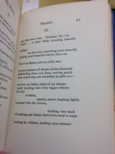
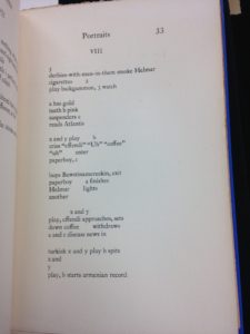
This is a book of poems by E. E. Cummings, published in 1925, just after the heyday of artistic cubism. Upon first glance, the reader can see that Cummings experimented with different ways of laying out his poems on the page. One of the important aspects of cubist art was appealing to different senses, such as the use of textured elements to appeal to the sense of touch through sight. Similarly, cubist literature, such as these poems, use the spacing on the page to influence the sense of sound–the spacing between words affects how one hears the poem in one’s head. Cummings was by no means the only writer to utilize these techniques during the cubist era–both Apollinaire and Gertrude Stein were well known for creating visual poetry, often in even more outrageous ways than included in this compilation.


img_2295
Sonnet VII

There are several examples of creatively spaced poetry in this book, including Songs I and XI and Portraits VIII, which are all pictured below. However, possibly the most intriguing use of space is in Sonnet VII. Sonnet VII is a Petrarchan (or Italian) Sonnet, following the structure of an octet (abbaabba) followed by a sestet (cddeec) and written in iambic pentameter. Sonnets are one of the most rigid forms of poetry, and are usually identifiable first by their shape. However, Sonnet VII does not look like a “regular” sonnet: it has breaks mid-octet, mid-sestet, and even mid-line. For readers who are familiar with the rhythm of reading a sonnet, it almost feels awkward to read the poem with the added spacing. Since this poem is already a very sensory poem, appealing to both smell and sight, this additional play on the sound of the poem provides the perfect example of how cubism influenced the senses of literature.


img_2290

img_2294

img_2292

Pablo Picasso: Three Musicians (1921)

Pablo Picasso: Three Musicians (1921)

picasso-three-musicians-1921-at-moma

This painting, done by Pablo Picasso in 1921, is a perfect example of synthetic cubism. Picasso began painting in this style in 1912, so this piece was created well after he established the style. At first glance, the image appears to be a group of musicians, but upon closer inspection, it becomes clear that there is little to no distinction between the different people. In fact, the instruments and sheet music are almost easier to discern than the people playing them. This brings to mind the music created by the band: a given song is better enjoyed as a single piece, rather than by examining each individual part of the song. The contrast of bold and dark colors calls to mind the jazz age, which fits with the time period in which the painting was created.

Were this painting created in an impressionist style, it would likely retain its intense colors, but one would be able to distinguish the people in the image from each other. The clearly defined shapes and textures would disappear, and be replaced with thick brushstrokes creating somewhat blurry boundaries. However, Picasso’s painting shares an important characteristic with the impressionist style: the picture does not realistically depict the scene at hand; rather, it gives the viewer the impression of the scene by using artistic elements to recreate the feelings of the moment. 

Edgar Degas: L’absinthe (1876)

Edgar Degas: L’absinthe (1876)

degas-labsinthe-1876

Edgar Degas’ 1876 painting L’absinthe depicts a scene at a restaurant or bar: a woman is seated at a table, gazing at the floor. Next to her sits a man who is focused on something out of frame. The woman is centered in the picture, even though it seems as if she is the on the edge of whatever scene is occurring next to her. This perspective–focusing on the disappointed person on the edge of the action–plays a significant role in developing the melancholy mood of the painting.


The characteristic bold brushstrokes of Impressionism can be seen in this work. The lack of minute detail in the painting creates a foggy feeling, much like the despair evident in the subject’s expression. However, the most detailed part of the picture is the woman’s face–her expression draws the viewer’s attention due to the stark shadows and lines not visible elsewhere in the picture. By drawing the attention to the expression of disappointment on her face, the artist creates the mood for the work as a whole.


Additionally, Degas’ use of color adds to the overall mood: the painting is comprised almost entirely of neutral colors. The overwhelming presence of gray and brown adds to the melancholy feel of the painting, creating something that lacks the liveliness and energy of color.