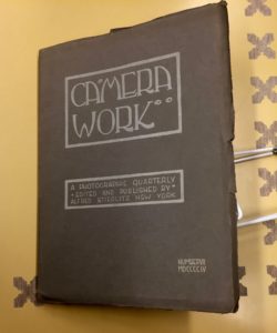
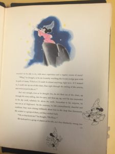
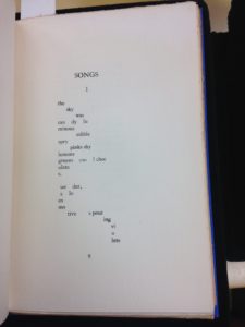
e.e cummings’ book of poetry
The object that I found to be the most interesting (not an easy pick by any means!) was the small blue book of e.e cummings’ poetry. I choose this object because of my love of his poetry, which made being able to personally hold a very early copy of his work particularly meaningful. The book itself was beautiful, the cover was very simplistic, however it was a really rich shade of blue. Cummings’ poetry is poetry that is very much meant to be seen visually, as a lot of the meaning of the poetry is found in the way he chooses to display the poems on the page. I have many books of his works, so although it was not my first time seeing the poetry in person, it did make it particularly meaningful to be able to psychically interact with something that I consider extremely important to me. Not to overstate it, but it really remind me of the concept of transcendence, in the way that I was able to derive such personal meaning from an object that was originally created decades ago. By physically interacting with the object I had a real sense of connection with all of those who were impacted by his poetry, even though we might be separated by decades. I found this to be really comforting, and really liked our visit to the special collections.
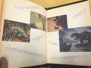
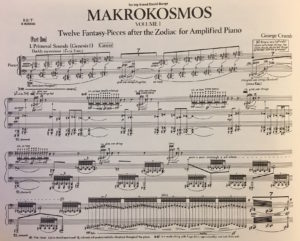
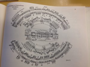 Out of everything in Special Collections, there was nothing else that I was drawn to as much as these manuscripts by George Crumb. It is easy to tell from the manuscripts that his work was avant-garde, but you can also tell by listening to the pieces being played. The pieces that I looked at were Crumb’s Prophecies of Nostradamus and Agnus Dei.
 Now every Agnus Dei that I have heard is different, but this is one extremely different format wise. The format is rightfully in the shape of a peace sign, as there is a part in piece saying “Dona nobis pacem,” which means “Give us peace” in latin. You also have to actively look for where this piece starts (it starts at the left diagonal line of the peace sign). This makes it difficult for the musician playing not only because of the format, but also because it requires vocalization from them. I would not go and say that this is the most creative version I have seen (go look at Agnus Dei by Leonard Bernstein), but it certainly is something else.
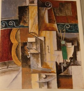
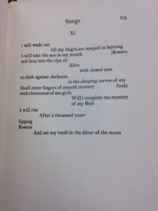
 This is a book of poems by E. E. Cummings, published in 1925, just after the heyday of artistic cubism. Upon first glance, the reader can see that Cummings experimented with different ways of laying out his poems on the page. One of the important aspects of cubist art was appealing to different senses, such as the use of textured elements to appeal to the sense of touch through sight. Similarly, cubist literature, such as these poems, use the spacing on the page to influence the sense of sound–the spacing between words affects how one hears the poem in one’s head. Cummings was by no means the only writer to utilize these techniques during the cubist era–both Apollinaire and Gertrude Stein were well known for creating visual poetry, often in even more outrageous ways than included in this compilation.
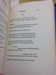
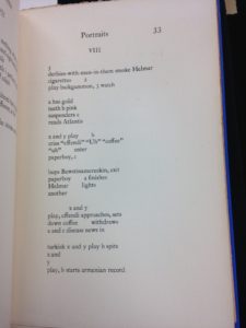
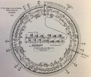 I also chose to include the circular manuscript, The Magic Circle of Infinity,